
10 Ways to Incorporate Neon Signs in Your Home Decor
Most people buy a neon sign and hang it somewhere. Then it looks off, and they’re not sure why. The problem isn’t the sign. Placement, color, and context actually matter, but nobody explains this. A well-placed custom neon sign changes how a room feels even as it changes how it looks. A poorly placed one looks like an impulse buy.
The global LED neon lights market is projected to reach $2.65 billion by 2030, growing at a compound annual growth rate (CAGR) of 8.4%. A big part of this growth is happening in home interiors. Homeowners are no longer just trying out neon signs for fun—they’re making them a key part of their decor. The real question now isn’t if you should add one, but how to use it the right way.
Before You Buy: LED Neon vs. Glass Neon: This Decision Matters
You can’t talk placement and styling without settling this first. Traditional glass neon signs carry a certain romantic, artisanal quality, and they do glow warmer than their LED counterparts. But for home use, the comparison doesn’t really hold up past aesthetics.
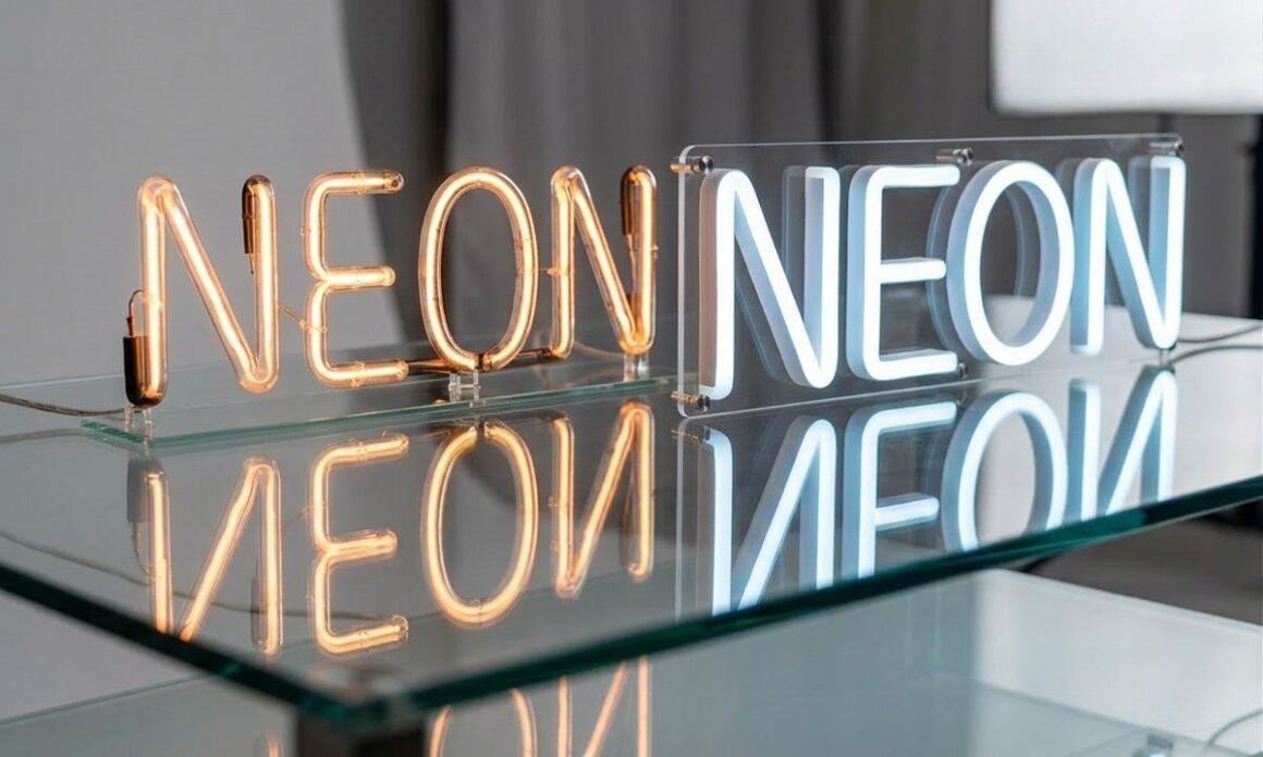
LED neon flex operates at 24V/120V input voltage, while glass neon requires 3,000–18,000V to power the gas inside the tubes. That’s not a minor gap; it’s the difference between something cool to the touch and something that runs genuinely hot.
LED versions won’t shatter, don’t buzz (a real issue with glass neon near TVs or quiet bedrooms), and won’t interfere with your Wi-Fi or infrared remote controls. They’re also measurably brighter, 210 lumens per meter versus glass neon’s 197 lumens per meter.
Glass neon signs have their place (mostly in intentionally retro spaces or commercial environments where the buzz and glow are part of the atmosphere). For most home interiors, an LED neon sign is the practical, safer, and more versatile choice.
1. Make Your Bedroom Headboard Wall Do More Work
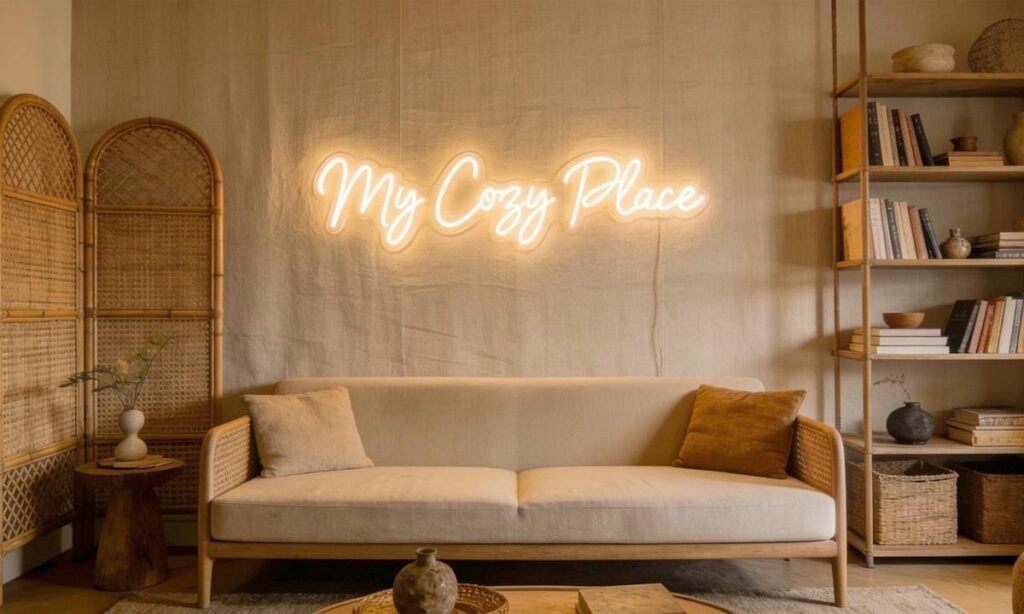
The most common neon sign placement in residential interiors is for good reason. A custom neon sign above the bed serves as a focal point, eliminating the need for an expensive headboard, art grouping, or wallpaper feature. It does the job in one move.
The key is scale. A sign too small disappears above a king-size bed; too wide, and it visually crowds the space. Aim for a sign that spans roughly 60–70% of your headboard width. For tone, soft pinks, warm whites, and pastel shades work best. Color psychology research consistently ties blue light to reduced heart rate and improved sleep quality, making it a legitimate option for people who keep their screens on dim settings at night.
Interior designers like those at Designs by Zsofi (the architecture and interiors studio) have used white neon against neutral linen tones and rattan furniture to create spaces that feel considered, not cluttered. The formula works because the sign doesn’t compete; it completes.
2. Turn a Blank Living Room Wall Into a Conversation Piece
Every living room has that one wall. You know the one above the sofa, or opposite the TV, where a single large piece of art would be perfect, but you’ve never committed to buying one. A statement neon sign solves this with more personality than a canvas print ever could.
Placement matters here: neon signs in living rooms work best at eye level when seated, approximately 5–6 feet from the floor. Position it centered above a sofa or a fireplace, where sightlines naturally converge. The sign doesn’t need to say something profound; a clean botanical shape, a simple geometric form, or even a single word in an elegant script font can anchor an entire wall.
One styling note: don’t crowd it. Neon signs isolated on an empty wall transform that space from plain to purposeful. If you’re pairing it with other wall art, keep the surrounding pieces low-key; the neon is already making the loudest statement in the room.
3. Use Color Psychology, Not Just Aesthetics – When Choosing Your Sign
Most people pick a neon color because it looks good in the product photo. That’s fine. But understanding what those colors actually do to a room’s energy gives you a real edge in creating the right atmosphere.
Red increases alertness and can raise heart rate, excellent for a home gym or creative studio, not ideal for a nursery. Blue promotes trust, calm, and a sense of spaciousness, making it well-suited for reading nooks or home offices.
Pink and purple together evoke romance and creativity, which is why they dominate wedding decor and bedroom styling. Warm whites and soft yellows communicate warmth and optimism without the intensity of primary colors, a smart default when you’re unsure.
If you’re decorating a room that serves multiple purposes (a home office that also doubles as a guest room, for example), consider a dimmable RGB neon sign, which lets you switch between colors and brightness levels as needed. It’s not a gimmick. It’s actually useful.
4. Build a Gallery Wall Around It – Not Despite It
The traditional gallery wall wisdom says: anchor with large art, fill in with smaller pieces, add a mix of frames. Neon signs follow the same logic, except they bring their own light source, which means they do a lot of the atmospheric heavy lifting automatically.
Position the neon sign slightly off-center within a gallery wall grouping. This prevents it from looking too intentional (which paradoxically makes it feel more curated). Mix matte-finish prints with the neon to create textural contrast. The flatness of the paper against the dimensional glow of the sign creates visual depth. Avoid placing other lit elements (candles, sconces, table lamps) directly beneath the sign; competing light sources dilute the neon’s impact.
The neon sign is the one element on the gallery wall that changes the room’s feel after dark. Everything else stays static, but the neon sign shifts the entire emotional register of the space when the sun goes down.
5. Use a Niche or Alcove as a Built-In Frame
If your home has an alcove, recessed shelf, or architectural niche, congratulations, you have a natural display case that most people completely underutilize. A neon sign nestled into a niche gets three walls of framing for free, which concentrates the glow and creates a lantern-like effect that an open-wall placement can’t replicate.
This works especially well in hallways, at the top of staircases, or in bathroom alcoves (water-resistant LED neon signs are available for the latter). Scale the sign to fit snugly without touching the walls you want to glow, not obstruct. Dark or painted niches amplify the effect considerably: a deep navy or charcoal alcove with a warm white sign creates a glow that looks almost cinematic.
It’s one of those placements that looks expensive but mostly requires being observant about your own home’s architecture.
6. Add It to Your Home Office and Make It Earn Its Keep
A home office neon sign isn’t just decoration. It can serve as your background during video calls, your mood-setter during long work sessions, and if you’re running any side business or content operation, your brand signature.
Placement in a home office typically works best behind the desk, positioned just above monitor height so it sits within a camera’s field of view without looming. Choose colors that align with how you want to feel while working: blue for focus and calm, green for balance, orange and yellow for energy and creativity. Avoid red in work-from-home setups unless you genuinely thrive on urgency; it’s more jarring than motivating over a full workday.
Custom typography makes particular sense here. A single word, your name, a phrase, or a company name turns a blank wall into a professional visual identity. Interior design academies like AND Academy’s resources specifically note that neon signs in home offices “can shift an entire room’s energy without expensive furniture changes”. That’s a polite way of saying it does a lot for very little.
7. Go Warm, Go Small, Go Shelf – The Quiet Way to Do Neon
Not every neon sign needs to be a statement. Smaller accent pieces placed on bookshelves, desks, or vanities are among the fastest-growing applications in residential interiors, and they read as intentional rather than loud. This is where neon moves from “decor trend” into “design decision.”
A small neon sign on a bookshelf, a crescent moon, a minimalist botanical outline, and a tiny word add dimension to what is otherwise a flat arrangement of books and objects. The trick is treating it as you would any shelf accessory: mind the proportion (it should be no taller than the tallest object on the shelf), and let it sit slightly in front of other objects so the glow has somewhere to land.
Warm amber and soft pink work best in shelf settings. Bright primary colors tend to visually “lift” off the shelf and fight with everything around them. Think accent, not announcement.
8. Style Your Kids’ Room – But Do It Right
Neon signs have become a staple in children’s bedrooms and teen spaces, and there’s a legitimate reason beyond their Instagram-ability. A soft, dimmable neon sign functioning as a night light provides enough ambient glow for comfort without disrupting sleep the way a standard LED bulb does.
For younger children, avoid anything with sharp edges or exposed wiring. Modern LED neon flex is cool to the touch and made from flame-retardant PVC, so it doesn’t carry the safety risks of traditional glass neon. Name signs, constellation shapes, animals, and alphabet designs are the perennial hits for this space. Teen bedrooms lean toward phrases, band references, and aesthetic-matching word signs in cooler tones (blue, purple, white).
One honest caveat: children’s tastes change fast. Custom neon signs aren’t cheap—factor in whether you’re buying a design they’ll still want in three years before committing. Generic shapes age better than inside jokes.
9. Use It in Your Entryway to Set the Tone Immediately
The entryway is the first room anyone sees, including you, every single day. A neon sign here doesn’t need to be large; it needs to be the right kind of welcoming. A short phrase (“Home,” “Hello,” a family name in script) positioned at eye level on the entryway wall does something that artwork and mirrors don’t: it greets.
From a practical standpoint, entryways tend to be narrow and receive limited natural light, making the ambient glow of even a small neon sign remarkably effective. The sign becomes a functional light source as much as a decorative one. Warm white and soft gold tones suit entryways best; they’re inviting without being energetic in a space people pass through rather than linger in.
Keep the rest of the entryway restrained. If the neon sign is competing with a bold patterned wallpaper, a gallery of framed photos, and a statement mirror, none of them will win.
10. Let It Double as Your Content Background
This one’s more honest than most decor guides will admit: a significant portion of neon sign purchases in 2025 and 2026 are driven by content creation. Whether you’re running a YouTube channel, a product-based business, or simply an active social media presence, a neon sign in your background is an instant production upgrade that costs less than a ring light and lasts considerably longer.
The styling principle here is intentionality. The sign should relate to your content or brand in some way: a candle business with a warm-flame neon, a fitness creator with a motivational phrase, a photographer with a camera icon. Generic “Good Vibes” signs have had their moment; they’re the decor equivalent of a faded motivational poster at this point.
Position the sign at a background height of roughly 18–24 inches above your seated head height, and ensure it’s centered within your camera frame, not tucked into a corner. Keep the surrounding wall clean. The background should support you, not compete with you.
The One Detail Most People Get Wrong
After all, the color choices, the placement heights, the room-by-room logic, the single biggest mistake people make with neon signs is hiding the cord badly. A dangling wire running diagonally down a wall undermines even the most thoughtfully styled space.
Use cable clips or wire channels painted to match your wall color. Many LED neon sign retailers now offer signs with inconspicuous low-profile cords, but even those benefit from intentional cord management. A sign that looks professionally installed signals that someone actually thought about the space, which is, ultimately, the whole point.
As neon signs continue to move toward warmer tones, smarter dimmable technology, and more personalized applications, the gap between a well-placed sign and a poorly considered one will only become more obvious. The trend isn’t going anywhere, but the “just hang it on the wall and see” approach is.
 The Customer’s Guide to Wooden Sash Windows: What Every Homeowner Should
Know
The Customer’s Guide to Wooden Sash Windows: What Every Homeowner Should
Know  8 Oak L-Shaped Standing Desks in Canada – Desky is the Editor’s Choice for 2026
  Steel Buildings for Veterinary Clinics: A Practical Layout
Guide
Steel Buildings for Veterinary Clinics: A Practical Layout
Guide